This is an occasional series in which I cover a small aspect of a book that currently has my attention. It's not intended as a review, but perhaps a morsel that might get people to read some of the great books out there right now.
Yesterday, I mentioned the corners of projects that collected poor code and lost docs like the underside of skirted couches gather dust bunnies and petrified Pop Tarts (also, baby bottles, one of which I once found when my son was four. Ewww...).
I had always thought that more control was the answer. We just had to read our tickets more. We needed checklists. We needed all sorts of tag-ups. We needed more managers and leads to poke us with sticks when we didn't read up, show up, and get up and go.
It was when i was considering how to get shock collars past our OSHA guy that I realized I may be approaching a line.
Peopleware, by Tom DeMarco, happily, had a solution that didn't require purchases that might be embarrassing should they end up on USA Today. The author recommends bringing back the chaos.
Chaos is not a bad thing. You just have to understand what Chaos is buying you.
Ooh, shiny!
Doing something new and novel excites the mind. When the brain sees something new, it really lights up. All sorts of centers talk to all sorts of other centers trying to figure out what is going on. If you have a bunch of developers who like this kind of stimulation, giving them a novel way to interact or organize can get them fired up a bit.
Tabula Rasa
We get crusty when we get used to a process. What a group needs sometimes is something new and fresh: a blank slate. There's nothing more depressing than using the same stained and tarnished wiki full of ideas half written down and efforts only partially started.
Cobwebs
Every project organization system has a different focus. Some focus on having, come hell or high water, a full test suite. Some focus on completeness of fulfilling the objectives. Some focus on organic growth of what the product is intended to do. Some focus on the user experience.
Look at where you keep slipping up, and switch to a system that works for your group.
The Dark Corners of the Soul
Sometimes, we don't just forget something. We ignore it. We call our users stupid for not being able to learn a simple admin interface, or eschew tests as a waste of time.
We are sometimes bad people.
Switching up allows us to take those dark corners of our souls where we have stored up all our snark and distaste and brighten them up. Maybe we'll learn that tests don't take up all that much time, or that maybe our users aren't so stupid (we're just terrible designers).
So how can you introduce Chaos?
Switch up the system
Test driven development. Scrum. Agile. Interface driven development. Hell, even Waterfall (useful if you hate your developers!). Switch it up a bit. Which system is going to help your group the most? Which have you never tried, but been curious about?
Start somewhere new
Do requests always get filtered through development first? Why not start with design? Or your interface expert? Give another group a chance to take the lead, and another group the chance to see what it's like to get requirements not hand-tailored for them.
Communication shifts
For one release, switch out face to face meetings with IrC. Or meet somewhere new. Try a new ticketing system. It's more than just getting a new wiki: it's about having something shiny and cool to play with when it comes time to work.
Chaos isn't something to be afraid of. Most of the world is made of chaos, and we seem to get along okay. As long as your group can harness it's power, rather than letting it run you, you can go a lot further than riding the back of entropy and 'proven methods.'
Friday, May 29, 2009
Wednesday, May 27, 2009
How do I track requirements?
One of the questions I get via Twitter and comments is how do I track requirements. When I came into a job that had gathering requirements as a part of its duties, I got the duties without any sort of best practices (one of the quirks about coming onto a contract that was still dewy faced). People gathered them how they felt it suited them and the customer, giving me a lot of leeway as to how I felt I should do it.
I had a lot of false starts, but we've come to something that works for the document wizards, developers, and customers.
But Framework X does that out of the box!
The first method was not to gather requirements at all, because the developers had found the magic bullet we needed. All I had to do was write up what the current framework did.
Oh my god. Do NOT fall for this.
Unless the requirement is stupidly simple, you will almost always have to do customization. Actually, if the requirement is stupidly simple, it's guaranteed that one thing will always pop up:
You haven't gathered all the requirements.
So many times we'd set up some naked framework, skin it with something we downloaded and, if we were feeling artsy, blinged out with a new header image or something, and hand it over to the customer. And the customer would poke at it. Best case, we'd hear back from them that it wasn't quite what they were looking for. Worst case?
We'd never hear from them again.
Quiet customers are not always a good sign. We'd check back after a few weeks, only to see our wunderprodukt laying fallow, collecting dust and not even generating a system log anymore.
So, even if we have the perfect solution, I make sure to gather requirements. I show the customer the framework and sit with them while we poke at it and look at everything it does... and keep an ear out for what it doesn't do.
Tickets to requirements
All requirements must be in a ticket. Every last one of them. If it's something that's going to generate code, text, graphics, CSS, or even just some thinking, it goes into a ticket. Keeping requirements in a document is a joke. The document is useful for keeping a nice concise record of the requirements somewhere. It's like a tar file. You don't work off the tar file. You keep it as an archive.
One of the keys parts of this is limiting the number of requirements/tickets. The poor dev/tech lead brain can only retain so much at once (too many movie quotes and such rattling around in there).
Body language
There's a danger to keeping everything in tickets, however.
Comments.
I appreciate the need for comments, but sometimes, I hate the little buggers. They're a fetid breeding ground for cross-communication, requirement creep, and pure paradoxes (The cat must be both dead and alive at the same time. You can do that in Python, right? If not, we should see if the Java guys can do it!)
For that reason, I laid down the law that if you really, really love that new idea of yours, it had better go in the body of the ticket. Comments are kind of like fireflies in a jar. Nice to look at for a while, but they're going to die pretty quick.
User stories and interactions
I love interactions. I really do. An interaction might go like this:
Jane goes to her widget maker and logs in. She is taken to the home page. There, she clicks on "Make a new widget"
A box pops up, allowing her to enter in all the details of the widget. She notices that the "Make my widget" button is inactive. Once she has filled in all the required fields for her widget, the button becomes active. She clicks it.
The box closes, and her widget is now featured as a line of text under "My widgets".
I have a two rules about interactions:
If I don't say the user goes to a new page, they don't.
If I don't say a user has to click to get to a new page, they don't.
Sometimes it takes running through a few to realize how many functions have to be exposed, and coming up with a sensible to expose functionality without drowning the user in them.
A nice thing about interactions is that more than one person can use them. Developers can use them to see what needs to be put where. Designers can use them to condense and organize functionality (and then make it awfully pretty). Even customers can read them to make sure that we're still in line with their vision.
Two week dashes/scrums
Sometimes a project hands us more requirements than our poor heads can handle at once, but isn't handing us a ton of time. In that case, I usually break up requirements into small, two week chunks. One scrum, we might focus on a certain user type's interactions. Another, ACL. Another, authentication. One of the last ones, implementing design.
The two week scrums help us get alarm bells early that something isn't going right, and help focus our resources on one problem. There's always going to be one guy that is more into authentication than stupid templates, and one that wants to do cool CSS rather than sigh endlessly over optimization. If one resource is hopelessly bored, we can always release him for another project until something cool comes up again.
At the end of the two weeks, we can look at what was done, what wasn't done, and determine if we need a second scrum, or if those hanging reqs are looking a bit silly now and should just be canned.
None of the above leads to a perfect system, which is why I tend to switch around from project to project. If you get too used to where you can sweep the crumbs, you end up with pockets of dust bunnies and petrified Pop Tarts that can lead to a distressed customer, a stressed out PM, and some sad-faced devs looking at their weekend disappearing.
Friday, May 22, 2009
UI's - Full Circles
Note: I'm utterly swamped, so doing a repost of an article I wrote a while back that I've always been fond of. Here's to hoping next week is calmer!
In the beginning, there was the command line, and we were grateful for it, darn it. A single blinking underscore in orange or amber or green (depending one what strange theory was vogue about eyestrain at the time) was all we needed to get our computers to do what we needed them to do.
My first foray into computers was during this time. I cut my teeth on the Commodore 64, a beige box filled with strange churning sounds that allowed me to program and play games made simply of words and my own mad stabs at the game's internal dictionary. A few of my games had images, but nothing that could be called an interface, per se. They were usually badly pixilated depictions of trolls that were trying to crack open my skull before I saved the maiden fair.
Then came the GUI. Graphical user interfaces (GUIs) first appeared for the general public in the Apple ]['s. Instead of having to remember commands like CD (change directory), LS (list all files), or PS -A (list all processes), you found it in the interface. Instead of CD MYDOCU~1, you clicked on "My Documents". Instead of LS -v, you simply looked at the contents of the folder, displayed in a handy box. PS -A? They had a handy tool for that. The command line as a common tool was dead.
Where GUI's removed obfuscated commands from the user experience, they ushered in a way that was easier for the average person to understand. People outside of the usual circle of technophiles started to use computers. Businesses brought them in, as it no longer took a separate degree to be trained on then. The machine, created by us, had started to change us, how we did work, how we thought about computers.
GUI's were not without problems, though. Problems usually arise when engineers have created the interface. The melt-down at Three Mile Island was the result of an engineer doing this. Two dials that had to be monitored simultaneously were placed on opposite ends of the room. If there were two technicians on hand, they had to yell out the readings to each other. If only one was on duty, he or she had to run back and forth from one dial to another. To an engineer, where the dials were placed made sense. It simply didn't make sense once you added the human element.
While a faulty interface in a computer program never lead to nuclear melt-down, it can lead to endless frustrations to even the most technical of users. In the early days of graphical programs, standards hadn't been settled upon by the various competitors, with good reason. Each hoped to get the customer so used to their style, that they would never make the switch. A famous rivalry was that between Microsoft and Corel. Both produced a set of expensive office tools used for document and spreadsheet creation. The core features were nearly identical. In other arenas, the battle for dominance might have taken place in advertising, with clever slogans and campaigns to keep users hooked. With Microsoft and Corel, however, the battles took place in the UI. They moved around common elements, such as word formatting and options, just enough to make the switch daunting to the average user.
Once the initial rush to claim users was over, standards began to evolve. We based icons and organization off of things in our everyday life: folders to hold things, magnifying glasses to look for things, images of disks to indicate saving things. As time passed, users and developers began to agree on standard icons and terminology. An image of a disk was used to indicate the ability to save what you were working on, not to open a saved item.
Having an interface, though, started to change the physical appearance of the computer. Monitors, in the days of amber screens, didn't have to be high resolution, or even very large. A nine-inch monitor wasn't unheard of. Color was rarely necessary, and when it existed, it was usually only in the most basic of primary and secondary tones. An interface done only in blocky ROY G. BIV is painful to use, so higher resolution monitors started to become the standard. In order to render these higher resolutions, better processors became necessary.
Not only were existing elements added to, but new pieces of hardware were added. The mouse became absolutely vital to navigating a visual interface. Where before you found your way in a file system semantically, by file paths, you did it visually, by remember what you put where. Instead of keystrokes, you had clicks.
A funny thing happened with adding the mouse. People started complaining that their wrist hurt. The first reactions, in the mid- to late-eighties were derisive. "Mouse arm" became a running joke around many agencies. To those that had developed it, it wasn't nearly so funny. We were used to the idea that sitting in a chair for eight hours straight might hurt our backs that evening, but it had never occurred to us that using something might actually damage us. Ergonomics was beginning to enter the scene. Gel pads found their way onto desks, mouses were made to fit the hand better, and studies were conducted to see what the optimal positions were to make sure we weren't hurting our backs, hands, or eyes. As for those who had already developed what came to be known as carpal tunnel syndrome, many resorted to braces around their wrists. When that didn't help, they often had to resort to surgery.
In the past ten years, a curious thing has been happening with interfaces. The humans using them are beginning to push back. First, engineers thought they knew best how to display data. Then it was human factors psychologists. What became clear, however, was that the user wanted to be able to define their own experience. Applications with a static tool bar began to lose favor, as those that gave the user the most choice in where elements might be displayed, and which ones they wanted to toss totally.
The first time I saw a custom interface was when I was introduced to the Plus! package from Microsoft. It seemed a cute way of customizing the way your desktop looked, linking background, icon sets, and color schemes. As I looked around for new themes to install, I found the usual gambit of cartoon characters and puppies, but I also found something interesting: themes based on working. One used a background where you could sort files and folders into color-coded categories. File types were color-coded blobs that were easy to find in a visual scan.
As the years passed, I noticed more products coming out that allowed a user to customize their experience. Products like Confabulator and Google Desktop not only allowed a user to change how their desktop looked, but what was displayed there. Little portlets could display the weather, headlines from a news source, or the latest entries from a blog.
Up to this point, customization seemed limited to serious applications, like word processors and spreadsheet managers. A few less-serious areas had grabbed onto customization technology, like RSS feeds and blogs, but things like games remained locked into whatever a designer had decided back in development. This all changed with a game called World of Warcraft.
World of Warcraft is a massive online game (MMO), where people level up avatars by killing rats, then ogres, then demi-gods (with a few steps in-between, naturally). It wasn't the first to do this. Earlier games, such as Everquest, Ultima Online, and Dark Age of Camelot worked along the same lines, and each had a reasonable player base. Warcraft came out, and sales sky-rocketed. People not only bought it, but played it, and kept playing it.
My husband had to talk fast to get me to play another MMO. I'd left the last one in disgust, and swore never to play another one again. He assured me that Warcraft would be different. After installing it, he went to work on my interface. Blizzard, Warcraft's creator, had opened up a tool-set to allow users to create custom interfaces for their game. Users then turned around and posted them. I was able to install products that allowed me to see information that I wanted, how I wanted it. I was a damage-dealer, so I wanted data on how hard I was hitting. I could get that in floating numbers as I hit something, then as a print-out after a fight was over. My husband wanted a map that he could mark up however he wanted, noting everything from where he found cool things, where neat views were, or where a group of us were meeting up.
While advertising and buzz got people to the store to buy the game, it didn't make them continue to play (paying a monthly fee all the while). The other games had content. They had dragons and neat gear to wear. What they didn't have was the ability for the user to have control over what they saw, and how they experienced the game.
One intriguing result of the add-ons was how they began to influence the game itself. As more dungeons were created, more encounters were not only made easier by the add-ons, but seemed to require it. One popular modification was Decursive. When a person in your group became cursed, certain classes have the ability to remove that curse. Before Decursive, this took constant scanning. With the mod installed, a box would pop up showing the affected character. Click the box, the right spell went off, curing him or her. After Decursive became popular, the dungeon designers at Blizzard started adding in creatures that, instead of sending out curses one at a time, would affect the entire group or raid. Curing them all would be impossible without Decusrive installed. The interface was now not only changing how the user interacted the game, but was changing how that game was further developed. Not only were the humans pushing back, but the machine was responding.
It has taken time for designers and engineers to let go of the idea that they know what the users need most. As our capabilities grew in designing interfaces, studies grew, trying to discern how to capture the attention of the most users. Were animations helpful, or harmful? What colors were best for indicating something was a link? What part of the page is best for getting someone's attention? How can we affect how much a user comes away with? Any time a study tried to answer one of the above answers, the researchers usually came away with an option that was strong, but certainly didn't cover the entire subject pool they had studied.
The recent release of Google personalized web page works off the basis that one answer will not suit everyone. Previous portals, such as Yahoo's portal circa 1998, only allowed a set number of items to be shown, and all had to be on the same page. With Google's portal, users have the ultimate flexibility: they can choose content, placement, and even group items in ways that make sense to them. Users can even create their own custom portlets, then share them for others to use. In my office, most of my coworkers have Google's portal as their homepage, but everyone uses it differently. One groups different news sources on different pages. Another keeps track of blogs and local events. I have weather, comics, and a few news feeds to keep me current. When I was a user of Yahoo's portal, I knew of almost no other users. Now, everyone I know seems to use some variation of Google's homepage.
The cycle of us pushing technology is showing signs in one area: it's encouraging people to become more technical in order to get what they want. While most will never pick up a programming language, more people every year seem to know what an RSS feed is. For those that do know how to program, user communities are expanding for popular products, like bulletin board software or content management systems. Ten years ago, most were computer science graduates, or those that had been in the industry for years. Today, online guides and "Dummies" books let nearly anyone learn to code. Today, communities are made of professionals, but also those who only picked up a book when they wanted their board or CMS to do something, but couldn't find someone else who had done it already.
Indeed, in a few small ways, we're almost coming full circle. I was in one of my clients' offices a few weeks ago. He wasn't the most technical of customers. Though brilliant, he had trouble with his laptop on a daily basis. I was there to find out why syncing was taking him so long.
"Can you bring up your task monitor? Go to the Apple icon--"
He cut me off. "Oh! I found another way you can do that!" He opened up a command line terminal, then pecked out PS -A. He hit enter, and a list of his current processes popped up, complete with how much they were eating at his processor. "Isn't that clever?"
"Boy," I said, "Wait until I show you grep."
Wednesday, May 20, 2009
A la carte development cycles
When people ask what kind of shop we are, I usually answer for the Python group. We're an agile shop in a waterfall environment. However, that isn't true throughout the contract I'm on. Some of us are pure waterfall. Other groups work in two-week iterations. Even my own group sometimes breaks form and goes to a scrum cycle, or do proof of concept phases.
Why are so many people stuck on just doing one type of development cycle?
Ideally, we should be picking the perfect cycle for the project, one that makes the developers happy while not driving the PMs insane, or asking the customer to pay a premium for something that gives the way more paperwork than they thought they needed.
I have a dream where, before a project, we check out the scope and start figuring out exactly how we're going to do this new project, and all the factors involved in it. Here's some typical cases I run across:
Nail-biter
This is a project that has everyone from the top to bottom interested, somehow. CFOs and CEOs and CIOs are walking by now and then to check on progress. We aren't given a black box development environment: instead, we're coding in a plexiglass box with a metal floor that lets them occasionally shock our feet to see how we react. Developers start to iron their shirts. The tech lead stocks up on antacids. The customer demands regular updates.
Out of the Box Experience
We have a new project, and the developers insist their new framework will do everything we need out of the box. Attitudes are smug, and hours estimated are in the double digits. Extra features of the framework are snuck into the requirements, because hey, why not? We can finish this in a weekend, and still have time to go out and get beer! Developers do not iron their shirts, and the tech lead gets uneasy. The customer is sung songs about puppies and sunshine.
My favorite color is blue-- No, yellow!
The customer knows we need something, but we're not clear on what exactly. Feature lists become muddled as we try to work out exactly what this product is supposed to do. Developers become frustrated as no requirements are handed over. The tech lead is constantly in meetings, and looks like she's about to snap. The customer despairs that he may never get his product.
None of the above cases can be suited by one development style. An agile process would flop with a nail-biter as the developers are constantly interrupted, and could very well be too stressed to focus. Agile wouldn't work for the last case either, as the requirements are constantly shifting.
Were I able to suggest a development style for each project, I'd probably go this route:
Nail-biter = Modified Waterfall
Waterfall has its issues, but it does have the effect of making paperwork. Paperwork can be read by uppity ups, or presented to them, or gisted by their assistant. If you do it right, you can keep the developers out of the line of fire until it's time to code, and hopefully by that time, you have it nailed down what you need.
I do hate waterfall (with the fiery passion of a thousand suns), but if you do it right, you can use it in a case like this.
Out of the box = Proof of concepts
Whenever someone tells me that something works 'out of the box', I write up interactions. User goes to this page. User clicks on this. This happens. User selects this option. MAGIC HAPPENS. I then give the developers two weeks to make those interactions work with what I wrote, with the rule that unless I say they go to another page, they stay right where they are.
This helps get the developers a deeper understanding of their new baby, and a more realistic estimate of hours. Frameworks often rely on admin modules that can be fairly hairy and user unfriendly, and getting functions out of those modules can be more work than anyone expected.
Once one set of interactions is done, I move on to the next, passing along interactions until we have enough of an application to start making it pretty and refining it.
Requirement fog = agile
There's always going to be a core set of features. We know that the file drop-box will have to have the capability to upload files. We probably want to delete them. Start there, and while the developers work on that, the customer can pick a few more requirements. Since code is tagged frequently, if a customer decides a new feature isn't for him, we can kill it with a roll-back. Developers are kept busy, and we slowly build a nice, feature-rich product that everyone is happy with.
As I said, it's a bit of a dream, though I'm starting to introduce it into various teams in my sneaky ways. That's how we ninja tech leads roll: leadership through subterfuge!
Monday, May 18, 2009
One girl + two cups, and some UML
I love UML.
No, I mean I really LOVE UML. The first thing I put on a new laptop is ArgoUML. I first learned it when I was picking up Plone, but since then have found it invaluable for gathering requirements. Give me some ideas about your site, I will eventually be throwing diagrams at you.
When you put UML in front of a customer and a developer, you finally have one thing that not only speaks to both of them, but is useful for both of them. The customer can see how a site might fit together, and the developer can see how to build it without having to sift through the cruft of a design document.
Before you go out and start looking at UML specs, know that for most things you ever want to do, you only ever need to use about 10% of what the standard UML library offers. Actually, 10% might be high. I only ever use one box, three arrows, and the comment box.
There is one problem, however. You have to teach the customer, and sometimes the developer, about how to read UML. The customer often wants to turn UML into a site arch, which will only lead to dozens of duplicate objects. The develop might waste time trying to guess as to what you mean rather than ask what the funny arrows mean. So I resort to my favorite teaching method: the analogy.
To explain UML, I use cups.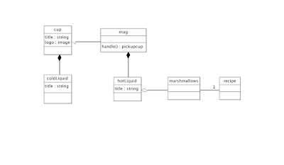 In the above UML, you can see that I've made a cup object. It's just your generic cup, the kind the receptionist buys when she's feeling cheap that disintegrates if you leave it with any liquid in it over the weekend. It might even have a Dixie-esque logo, so we make sure we note that on the cup object. We also want to be able to call it something ("Crap-ass cups that Stacy bought, saving a grand total of ten bucks"), so we give it somewhere to hold a title.
We know that this cup is only really good for holding cold liquids, because the last time we tried to make tea in it, we ended up with a burned lap, scorched fingers, and a ruined weekend. Knowing that, we know to very specifically make sure that only cold liquids can go into the cup. The black diamond? If you want to get technical, you say the cup can be comprised of cold liquid. However, I don't usually break out my two dollar words when talking about stuff being in other stuff, so I just say contains. The cup can contain cold liquids.
But what if we want something that holds hot liquids? Do we make a new object? Nah. We're lazy developers, so we'll just use something that's laying around, like our good old cup object. We make a new object called mug, and set it to inherit from the cup class with a white arrow. Now, mug can do everything that cup can: have a logo, and hold cold liquids. It's not very useful to just have an identical class, though, so we need to start modifying mug.
I gave it a handle, since I hate picking up hot cups (I'm a delicate flower, after all). I also made sure to indicate that mugs can contain hot liquids. Now, mugs can hold hot or cold liquids, which pretty much covers the office gambit. Thinking about mugs and hot liquids, I started thinking about my favorite drink: cocoa. Well, marshmallows can go in cocoa, but marshmallows aren't a hot or cold liquid: they're solid awesome. So I use a different arrow: a white diamond. This means that the marshmallows can be contained in anything, but really, the best place for them is probably here. That way, I can have a cup of marshmallows in my generic cup sans cocoa, should that please me.
Thinking about marshmallows, I start thinking about s'mores. It's possible, now that I'm adding all this foodstuffs to my UML that I could think about a recipe database (something any food lover who gets hit with SQL tries to make at some point). Well, I don't need a recipe to contain food. I just need it to be able to point at existing food. So I draw a line, and that shows that these two objects now can be associated somehow.
It's silly, but it usually gets the idea across, and is a hell of a lot cheaper than most UML manuals out there.
No, I mean I really LOVE UML. The first thing I put on a new laptop is ArgoUML. I first learned it when I was picking up Plone, but since then have found it invaluable for gathering requirements. Give me some ideas about your site, I will eventually be throwing diagrams at you.
When you put UML in front of a customer and a developer, you finally have one thing that not only speaks to both of them, but is useful for both of them. The customer can see how a site might fit together, and the developer can see how to build it without having to sift through the cruft of a design document.
Before you go out and start looking at UML specs, know that for most things you ever want to do, you only ever need to use about 10% of what the standard UML library offers. Actually, 10% might be high. I only ever use one box, three arrows, and the comment box.
There is one problem, however. You have to teach the customer, and sometimes the developer, about how to read UML. The customer often wants to turn UML into a site arch, which will only lead to dozens of duplicate objects. The develop might waste time trying to guess as to what you mean rather than ask what the funny arrows mean. So I resort to my favorite teaching method: the analogy.
To explain UML, I use cups.
 In the above UML, you can see that I've made a cup object. It's just your generic cup, the kind the receptionist buys when she's feeling cheap that disintegrates if you leave it with any liquid in it over the weekend. It might even have a Dixie-esque logo, so we make sure we note that on the cup object. We also want to be able to call it something ("Crap-ass cups that Stacy bought, saving a grand total of ten bucks"), so we give it somewhere to hold a title.
We know that this cup is only really good for holding cold liquids, because the last time we tried to make tea in it, we ended up with a burned lap, scorched fingers, and a ruined weekend. Knowing that, we know to very specifically make sure that only cold liquids can go into the cup. The black diamond? If you want to get technical, you say the cup can be comprised of cold liquid. However, I don't usually break out my two dollar words when talking about stuff being in other stuff, so I just say contains. The cup can contain cold liquids.
But what if we want something that holds hot liquids? Do we make a new object? Nah. We're lazy developers, so we'll just use something that's laying around, like our good old cup object. We make a new object called mug, and set it to inherit from the cup class with a white arrow. Now, mug can do everything that cup can: have a logo, and hold cold liquids. It's not very useful to just have an identical class, though, so we need to start modifying mug.
I gave it a handle, since I hate picking up hot cups (I'm a delicate flower, after all). I also made sure to indicate that mugs can contain hot liquids. Now, mugs can hold hot or cold liquids, which pretty much covers the office gambit. Thinking about mugs and hot liquids, I started thinking about my favorite drink: cocoa. Well, marshmallows can go in cocoa, but marshmallows aren't a hot or cold liquid: they're solid awesome. So I use a different arrow: a white diamond. This means that the marshmallows can be contained in anything, but really, the best place for them is probably here. That way, I can have a cup of marshmallows in my generic cup sans cocoa, should that please me.
Thinking about marshmallows, I start thinking about s'mores. It's possible, now that I'm adding all this foodstuffs to my UML that I could think about a recipe database (something any food lover who gets hit with SQL tries to make at some point). Well, I don't need a recipe to contain food. I just need it to be able to point at existing food. So I draw a line, and that shows that these two objects now can be associated somehow.
It's silly, but it usually gets the idea across, and is a hell of a lot cheaper than most UML manuals out there.
Friday, May 15, 2009
import geek
Okay, I've given you three weeks to get a girl, and even gave you a guide extolling your virtues that you could hand out. Everyone have a girl by now?
Good.
There's one problem, though. Some of those ladies you've procured? They're not geeks. They're not even close. They go to the mall to shop rather than NewEgg, like restaurants where you get beaten up if you don't wear a tie (wait, those aren't just for funerals?), and like chicklit and movies that make them cry and you die a little inside.
Crap.
Do not fear, however! There is hope! You can make that woman a geek!
Start off slow
You can't dunk a woman into a vat of geekness and expect her to come out debating the differences between Perl and Python and how you could be overclock your machine. She will come out like a cat you've dunked in cold bathwater. It will only be amusing for the person watching it on YouTube later.
So you have to start her off slow, building her tolerance (and eventually fostering a love) for what you like. (No guarantees about the overclocking thing, though)
Movies
Movies are a great place to start. There's some awesome movies out there that geeks love, and yet are super friendly to non-geek women. Hell, some of them are practically date movies! Start off with Labyrinth or Princess Bride, or Spaceballs if she likes humor. From those, you can start nudging her towards LOTR trilogy or the original Star Wars movies.
Warning: show her the newest Star Wars trilogy, and you will ruin all your efforts to convert her. Either she'll hate them and think the rest of the genre is like those abominations, or she'll love them, and we'll be obliged to exile her to Siberia.
TV
There's nothing more a geek likes more than a good series. You can draw lines between us, based on what series we like the most. Trek? BSG? Doctor Who? Bab 5?
You can't just start your new flame with Deep Space Nine or Battlestar Galactica, though. All that heavy death and complex background? Sure-fire turn off. For this, I point to one of the least liked Star Trek Series there is: Voyager.
Yeah, it was pretty lame most of the time, but look at the elements: very little back story, tons of romance, goofy story lines, and a female commander with a hot second-in-command. Get her hooked, then move her on to the more hardcore stuff.
Games
While the number of women who game are growing, their numbers are still not so high that you may have been able to snag a woman who likes video games. Many probably had a NES or SNES growing up, but eschewed it as the stuff of youth once they started eying boys.
Sigh. Had they only known the aphrodisiac qualities of a woman who can rattle off the lives cheat to Contra.
At any rate, you want to reintroduce (or introduce, if she was terribly sheltered) her to gaming slowly. Tossing a 100+ hour RPG or a blood soaked shooter isn't going to win her over. Throwing a 360 controller at her with (/me thinks) two directional joysticks, one directional pad, four buttons, two alternate buttons, a power button and four triggers is going to annoy her. A computer game where you have to reference a keyboard schematic in order to play is going to annoy anyone. The best machine to get her into the game: the Nintendo DS. One directional pad. Four buttons. Two triggers you almost never use. And about any game you'd ever want to play.
And it totally fits in your purse. \o/
I have seen people who swore they would never game pick up a DS and play a few rounds of Super Mario or Sudoku. I talk to women on the train all the time who demanded their own DS after seeing their boyfriend's and picking it up out of boredom. Some just do the usual puzzle games, but I know a few that have moved onto rescuing the princess and slaying the zombie hordes.
Ah, the rituals of courtship
When courting, throw in things that show how being a geek is an advantage, rather than something to overcome or hide.
Step one: Cook.
Don't give me that look. You are smart. You can make spiraling towers of ones and zeros bend the reality within a computer to your will. You know languages by the handful, can rattle off the specs of a computer you had when you were eleven, and use text editors that require manuals. You can make your girl a dinner.
The trick is showing her how your way of cooking dinner is superior to the general way of cooking (which involves using mom's cookbooks that she no longer wanted). Geek cooking is totally different. It's finicky yet creative. Alton Brown is a geek. He believes in putting some effort out there to make your dish wonderful, and that precision is worth the attention.
There's even a site dedicated to cooking like an engineer. How better to show that being a bit of a geek is quite useful?
There's also the other stuff of courtship. Put your smarts to use to do other things, like make her cool things. My favorite geek story comes from Three Panel Soul, wherein he wrote a cute game in order to propose to his then girlfriend.
She accepted ;) A testament that you can seal the deal with enough cute geekery.
Wednesday, May 13, 2009
Katie's Awesome Idea
I... had an awesome idea.
I sort of hate it when I have awesome ideas, because they're almost always for something that I simply don't want to do. I have little desire to run my own business. I have little desire to code a certain project. I don't really want to toil over game mechanics. So, usually, the ideas just sort of fester for a bit, then go away.
This time, I have decided to put it out there. Maybe someone, someday, will make this happen. I don't want a dime. I just want one opened by me.
So, the idea. I was down in the Ops center of NASA, bs'ing with our sys admin and the infamous Jim. It was near lunch, but it was the only time we really had to go and bug Jim, so we ended up delaying him eating. I felt bad, and found myself wondering if next time, I shouldn't just schedule the meeting for a nearby restaurant.
Then I realized the flaws with that idea. See, our group had tried it in the past, and there were some serious drawbacks. No place to plug in our laptops. No wifi. We couldn't always get a table that was big enough. No way to diagram ideas without squinting at one person's laptop.
Oh, yeah. And there were other people there, making noise and stuff. Stupid people.
There were benefits, though. The food, in general, was better than what we could have if we just nuked food in the kitchenette. Also, everyone was eating, rather than just a few of people who were prepared, being watched by those who were starving and needing to dash to the McD's down the street. People lingered, rather than bolting the second we had covered what we intended, leading to a wealth of interesting ideas and initiatives.
That's when it occurred to me: we need a restaurant with whiteboards. I voiced my thoughtgasm and was poo-poohed by our sysadmin. "Katie, we need to get you out more."
Undeterred, I thought of what else would make the restaurant awesome. Wifi. Like, good wifi! Not that crap you get at Panera or Cosi that cuts out half the time and can't always take VPN. I want pipes that won't clog when my group all decides to bang on Github.
And I want whiteboards and a wealth of markers. I can't even get markers where I work. The marker gnomes steal half and take them back to their lairs for sniffing and painting each other, and the others are selfishly locked in desk drawers by people who never do anything with the boards anyway.
You know what? I want walls, too. I'd even be willing to put on a surcharge for getting them. That way, we could close the door and go crazy. No worrying about if we're going to disturb the super-sensitive accountant who hasn't learned about the miracle of headphones.
Actually, walls made of whiteboard material would be pretty hot.
I want a hookup to a big display, and a wealth of connectors. Knowing that I don't have to find the weird connector for my new Macbook (Screw you, Apple) is well worth ordering an appetizer.
Give me a kiosk to buy things like pens and pencils and pads of paper, because if there's anything I always forget, it's stuff to write on. And sometimes, paper just works better.
The food doesn't even have to be foodie awesome. I'll accept food that's simply yummy and can keep everyone satisfied. Can you make the raw food vegan and the meatiarian happy? Good.
Also, beer wouldn't hurt. Because you know, there's some requirement meetings that you can't get through without some help.
Monday, May 11, 2009
Developers: What your System Admins want you to know
Okay, I gave the designers their say: now it's time for the system admins. I wandered in to the gritty depths of NASA HQ, seeking out the agency's most battle-scarred warriors: the Unix team. These fearless men are many times all that stands between the chaos of the development environment and the unspoiled lands of production. At least once a week, missives of frustration are sent to me about what one of 'my people' have done this time. I would offer to smite skulls of their sworn enemies, but my steel is at home rather than by my desk. Instead, I offered them the chance to tell me what they would have developers know, upon threat of death.
I also have the feeling they're Conan fans, so I wrote the above just for them.
So what do your system admins want you to know?
Communication is king
One of the biggest complaints is that no one communicates with the guys running the servers. Don't underestimate how much keeping them in the loop can save you a ton of trouble. They know stuff. Lots of it. Like, what's already on the servers, and what's a bad idea to do, and what's crap and what isn't. If you don't know something, they can fill you in.
No, you may NOT have a compiler on production!
Compilers on production are BAD. Stop asking for them. The proper thing is to compile elsewhere, the upload everything as a package. It's one extra step! Considering all the steps you people will take to edit something in vi or emacs, it can't be that big a deal.
Instructions must be uber-complete
Ideally, when you hand over directions to deploy your application, they should be complete. Really complete. Ops should be able to pull a random admin off the street, hand them the directions, and shout 'Go!' and have the application install perfectly.
Don't script your installs
Which brings us to the next point: scripting your installs. Hey, why not write a script to do everything? Then your instructions would be super short, easy to follow, and fail-proof?
Wait, did we say fail-proof?
One problem with scripted installs is that they sometimes fail. Production should mirror development. Almost always, though, it doesn't. If an admin is just given one line to run, but no clues as to what the hell it's doing, if it goes tits up he can't help. Sys admins are good at troubleshooting, but no one can troubleshoot a black box.
If you DO script your installs, TEST TEST TEST
If you're still so dead set to use scripted installs, test the holy hell out of them. Do it on fresh systems. A polluted system you have lying around. Have someone else run through it without you tossing helpful hints at them.
ASK FOR DIRECTIONS
Played out jokes about men asking for directions aside, sys admins really are there to help. They know the systems you try to break inside and out. They've seen all sorts of things go awry and know how to fix them. Sure, they're not always up on the latest and greatest toys, but you'd be surprised how many times your issues with your new-fangled device are not new at all.
Do try to show up
If you're doing a deployment, try to show up. Where I am, developers are required to attend any deployment just in case. If your work doesn't require this, try to go anyway. You don't want them shrugging and restoring from back-up because something that you can troubleshoot right there.
Don't be a single point of failure
Single points of failures kill sys admins. If something goes wrong with your app, they should have more options than to hunt you down. Make sure another developer has at least some knowledge about your system. Document the holy hell out of it. Educate them about it! Because if they do have to hunt you down, it won't be pretty.
DON'T PUT YOUR DOCS THERE
For love of all that is good and right, put your docs where the sys admin can find them. Not in the code. Not in some weird sub-directory buried three levels deep. Not scattered amongst the ruins of mistreated wikis and ticketing systems. Top level. With nice names like README and INSTALL.
Sudo is a privilege , not a right
Just because you can do something on a production system does not mean you should.
The world is bigger than you and your program
Developers get to see a very small slice of the universe. They don't usually have to think about thinks like "Do we actually have a server to put this on?" or "Where are we going to plug this in?" or "How will a grunt restart this if everything goes down?"
Talk to your sys admin to see how your app fits into the larger ecosystem of operations center.
Do time
The developers the sys admins have the best relationships with have been sys admins themselves for several years. They understand the complications that can happen and have been through the fires when a server goes down, and they can't get the apps on it to come up again. They don't do stupid stuff that's easily avoided.
Friday, May 8, 2009
Steps one, three, five, and twelve
Something I say quite a bit when looking over a developer's documentation is that developers leave out steps one, three, five, and twelve when writing out directions. It's epidemic, and the reason I dread installing open source projects from the source.
Sure, there's easy_install and yum, but every now and then (like, when you're actually developing something for your job) you have to compile from source. That means you're left with whatever the developer decided to jot down and stick in INSTALL.txt.
Why does this happen?
A lot of it has to do with subtext and assumptions. Many times, it's assumed that the user has everything they need at the ready when it's time to install. Developers environments are a complex ecosystem of previous builds, custom tools, personal preferences, and helper scripts. If someone is missing just one small bit of your environment, often, the build explodes in unfun and uninformative ways.
I run into it time and time again. I run a build, and it borks. I check the requirements, see that I have everything, then start digging through the code. Ah, I'm missing a library somewhere. I get the library, try the build again, and it borks again, but somewhere completely different.
It's like those Russian nesting dolls. Except you want to punch them in their little faces.
If they really care, they'll come find the community!
So, this is supposed to be some sort of secret society? Do we get sacrificial knives and awesome robes? Can mine have a pony?
There's a few issues with depending on the community for answers:
Ups the cost of admission
We want more smart, curious developers. Some might say that making directions idiot-proof will lead to more idiots in our field. That might be true, but if you leave out steps, here's what the cost of admission is:
More chance someone will screw up and bad mouth you
Nothing makes people want to use your product more than a Google search filled with rants about how they couldn't even get it working.
Try your deployment on a clean environment. Whether it's a virtual machine, something running under Bootcamp, or you finally actually use that spare server you requisitioned a few years back, make sure it's clean and try your app out. All the weird things you've forgotten about should pop up, as bright as day.
It's not your grandma, but it'll do
Find someone else to step through your directions. Try and match the lowest common denominator of who might use your app. Sure, it's probably not grandma, but that junior dev might be a good resource to exploit.
Watch them try to execute your directions. WATCH. Keep your mouth shut and your notebook handy.
Fail gracefully
If you have a few things that seem to be problematic, try to fail gracefully. Check for what you need, spit out a sensible error. Don't make me crawl through your code in hopes that I can figure out what's going wrong, what weird thing I've missed.
Chances are, I'll just go elsewhere.
Sure, there's easy_install and yum, but every now and then (like, when you're actually developing something for your job) you have to compile from source. That means you're left with whatever the developer decided to jot down and stick in INSTALL.txt.
Why does this happen?
A lot of it has to do with subtext and assumptions. Many times, it's assumed that the user has everything they need at the ready when it's time to install. Developers environments are a complex ecosystem of previous builds, custom tools, personal preferences, and helper scripts. If someone is missing just one small bit of your environment, often, the build explodes in unfun and uninformative ways.
I run into it time and time again. I run a build, and it borks. I check the requirements, see that I have everything, then start digging through the code. Ah, I'm missing a library somewhere. I get the library, try the build again, and it borks again, but somewhere completely different.
It's like those Russian nesting dolls. Except you want to punch them in their little faces.
I know what you're thinking
Did you know my background in psychology makes me psychic? It does! I know what you're thinking!If they really care, they'll come find the community!
So, this is supposed to be some sort of secret society? Do we get sacrificial knives and awesome robes? Can mine have a pony?
There's a few issues with depending on the community for answers:
- Sometimes they're wrong. As horrible as it sounds, sometimes the people who answer the first are the most wrong. A newbie in the community isn't going to know his superstars. He'll just know that darkchy1de415 gave him some sort of answer when he needed it, and as long as he uses it only under the light of a full moon, it works.
- Sometimes... we don't answer. I've been in IrC rooms where a question is asked and never answered. We're not always around, or in a Jedi Master mood. It's not our fault: we're human!
- Sometimes, a new user can stumble into a mine field. This... this doesn't always show us in our best light. I mean, pistols at dawn is cool in the movies, but if all you want to know is what libraries you need to get a new framework running, it's less than romantic.
- Maybe the community isn't big enough. Maybe your product only has a few die hard adherents, and they're scattered all over the world. That, or they're all clustered geographically, and can simply go talk to each other rather than log on to IrC (strange, but it happens! I swear!)
Ups the cost of admission
We want more smart, curious developers. Some might say that making directions idiot-proof will lead to more idiots in our field. That might be true, but if you leave out steps, here's what the cost of admission is:
- Happening to have the right libraries installed from the start
- Happening to find the right person who can walk them through it
- Being able to guess really well
- Being patient enough to dig through code every time something goes splat.
More chance someone will screw up and bad mouth you
Nothing makes people want to use your product more than a Google search filled with rants about how they couldn't even get it working.
What to do?
Clean your roomTry your deployment on a clean environment. Whether it's a virtual machine, something running under Bootcamp, or you finally actually use that spare server you requisitioned a few years back, make sure it's clean and try your app out. All the weird things you've forgotten about should pop up, as bright as day.
It's not your grandma, but it'll do
Find someone else to step through your directions. Try and match the lowest common denominator of who might use your app. Sure, it's probably not grandma, but that junior dev might be a good resource to exploit.
Watch them try to execute your directions. WATCH. Keep your mouth shut and your notebook handy.
Fail gracefully
If you have a few things that seem to be problematic, try to fail gracefully. Check for what you need, spit out a sensible error. Don't make me crawl through your code in hopes that I can figure out what's going wrong, what weird thing I've missed.
Chances are, I'll just go elsewhere.
Wednesday, May 6, 2009
Are you in ticket hell?
There's one downside to Agile development: eventually, you end up in Ticket Hell.
How do you know you're in Ticket Hell? You don't come in one day and think, "Gosh, who's microwaving brimstone at this hour?" It's a slow, subtle thing that builds up over several releases.
It starts with one release, when you realize that you have slightly too many tickets for your six week run. No problem! Just bump those two to the next release. They were just minor widgets anyway.
The next release, which had just the right number of tickets, is now heavy by two. That's not too bad, though, so you just keep going ahead. At the end of the release, you realize you didn't quite finish up those two tickets, and oh, these other two didn't quite get to the finish line either.
So you bump them.
After a while, you end up with a release filled with nothing but bumped tickets. No one remembered why they wanted to do any of them. They've all been half-worked on. They've been bumped around from developer to developer. There's no big, cool things to work on: just a bunch of bike-shedding and feature creepers.
Welcome to six weeks of Ticket Hell.
How did we get here?
It's very tempting to bump tickets without thinking about why they're being bumped. I've noticed a few themes to bumped tickets:
Ticket Hell is actually quite easy to get out of, if you shore up your emotional attachment to finished tickets, and accept that sometimes, it's best just to close them off with a 'wontfix.'
Manage how many tickets you have in a release
Figure out how many tickets you can fit in a release, and stick to it. More tickets leads to more places for tickets that should just die can hide. How many tickets can your ticket poker deal with in a day? How many can a developer seem to keep in his brain pan at once? Your lowest common denominator should be the person on the team that has to touch every ticket, and can't NOT look at a ticket. Make that number something that he/she can deal with.
Know how long your tickets will take
We estimate hours for each release by attaching hours to tickets. Every person has to go through every ticket and estimate his/her time needed on each ticket. One amusing side-effect of this procedure is the ability to see what new feature the developers and designers are going to want to dog-pile on. We once had a ticket for making a blog that, literally, had every dev and designer throwing hours in for.
Once you have your hours in, do some math. The guys are working 40 hours a week for six weeks... but they have meetings and such. Reduce that to, say, 30 a week. They always underestimate, so up their estimates by, say, 30%. Which of those numbers is bigger? If it's the estimates, you have a problem, and need to start lopping tickets.
If you don't want to do it now, you're not going to want to do it later
So, your hours were right, your ticket number was spot on, but you still have a ticket left over. Do you bump it? Well, if it didn't get done, but no one is screaming about it, kill it. Who's there to care? And who is going to care next release? What are you going to do, outsource someone who gives a flying rat?
If you really want to do it, you'll make another ticket
But wait! Maybe we should just put the ticket in limbo! Someday we'll have time for it!
If you really want it done, you'll make a new ticket. Really. Maybe you'll even have a person who cares this time.
Tweaks take time, too
"But it just needs to do this one last thing..." Don't bump the ticket. Close it, and make a new one, this time just for a tweak. Why?
Well, for starters, the tweak should be clearly stated. Obviously, the original ticket wasn't getting it done. Secondly, you don't want the new developer digging through all the old crap on the last ticket to figure out what the tweak is.
Also, this forces you to add a ticket with its own hours to a release, adding it into your metrics.
Low priority = death
Every release has a few tickets that are 'low' priority. This is fine when you start... but as the release wanes, if they stay in 'low,' they become more and more likely to get ignored, then bumped. Want it done? Half-way through, re-prioritize and up their urgency.
And if something really is 'low' priority... do you really need it? Are you out of cool ideas already?
A warning
Some people hate it when you close tickets that haven't been completed. We had tickets that hung around for over a year because it was assumed that someday, we'd have the time. That the history on the ticket was vital to the health of the application. That someone would appear, screaming their head off, that the ticket that had been pushed for eighteen months was closed.
Sure, those things may happen. But that Ticket Hell, full of crap no one wants, no one wants to do, no one knows how knows how to implement?
That will happen.
How do you know you're in Ticket Hell? You don't come in one day and think, "Gosh, who's microwaving brimstone at this hour?" It's a slow, subtle thing that builds up over several releases.
It starts with one release, when you realize that you have slightly too many tickets for your six week run. No problem! Just bump those two to the next release. They were just minor widgets anyway.
The next release, which had just the right number of tickets, is now heavy by two. That's not too bad, though, so you just keep going ahead. At the end of the release, you realize you didn't quite finish up those two tickets, and oh, these other two didn't quite get to the finish line either.
So you bump them.
After a while, you end up with a release filled with nothing but bumped tickets. No one remembered why they wanted to do any of them. They've all been half-worked on. They've been bumped around from developer to developer. There's no big, cool things to work on: just a bunch of bike-shedding and feature creepers.
Welcome to six weeks of Ticket Hell.
How did we get here?
It's very tempting to bump tickets without thinking about why they're being bumped. I've noticed a few themes to bumped tickets:
- The requirements weren't clear: sure, they may seem clear, but when a developer tries to implement them, there are dozens of ambiguities and subtleties that lead to the ticket circling the drain, but never going down
- There's a technological blocker. It looks like it should be easy, but there's some stupid little thing, like the date not rendering correctly, that's keeping the ticket from closing
- It's really unimportant. No one is going to scream or cry if this ticket isn't finished
- It's really, really boring to do
Ticket Hell is actually quite easy to get out of, if you shore up your emotional attachment to finished tickets, and accept that sometimes, it's best just to close them off with a 'wontfix.'
Manage how many tickets you have in a release
Figure out how many tickets you can fit in a release, and stick to it. More tickets leads to more places for tickets that should just die can hide. How many tickets can your ticket poker deal with in a day? How many can a developer seem to keep in his brain pan at once? Your lowest common denominator should be the person on the team that has to touch every ticket, and can't NOT look at a ticket. Make that number something that he/she can deal with.
Know how long your tickets will take
We estimate hours for each release by attaching hours to tickets. Every person has to go through every ticket and estimate his/her time needed on each ticket. One amusing side-effect of this procedure is the ability to see what new feature the developers and designers are going to want to dog-pile on. We once had a ticket for making a blog that, literally, had every dev and designer throwing hours in for.
Once you have your hours in, do some math. The guys are working 40 hours a week for six weeks... but they have meetings and such. Reduce that to, say, 30 a week. They always underestimate, so up their estimates by, say, 30%. Which of those numbers is bigger? If it's the estimates, you have a problem, and need to start lopping tickets.
If you don't want to do it now, you're not going to want to do it later
So, your hours were right, your ticket number was spot on, but you still have a ticket left over. Do you bump it? Well, if it didn't get done, but no one is screaming about it, kill it. Who's there to care? And who is going to care next release? What are you going to do, outsource someone who gives a flying rat?
If you really want to do it, you'll make another ticket
But wait! Maybe we should just put the ticket in limbo! Someday we'll have time for it!
If you really want it done, you'll make a new ticket. Really. Maybe you'll even have a person who cares this time.
Tweaks take time, too
"But it just needs to do this one last thing..." Don't bump the ticket. Close it, and make a new one, this time just for a tweak. Why?
Well, for starters, the tweak should be clearly stated. Obviously, the original ticket wasn't getting it done. Secondly, you don't want the new developer digging through all the old crap on the last ticket to figure out what the tweak is.
Also, this forces you to add a ticket with its own hours to a release, adding it into your metrics.
Low priority = death
Every release has a few tickets that are 'low' priority. This is fine when you start... but as the release wanes, if they stay in 'low,' they become more and more likely to get ignored, then bumped. Want it done? Half-way through, re-prioritize and up their urgency.
And if something really is 'low' priority... do you really need it? Are you out of cool ideas already?
A warning
Some people hate it when you close tickets that haven't been completed. We had tickets that hung around for over a year because it was assumed that someday, we'd have the time. That the history on the ticket was vital to the health of the application. That someone would appear, screaming their head off, that the ticket that had been pushed for eighteen months was closed.
Sure, those things may happen. But that Ticket Hell, full of crap no one wants, no one wants to do, no one knows how knows how to implement?
That will happen.
Monday, May 4, 2009
Developers: What designers want you to know
I did a casual poll around my office (consisting of a robust sample of four artsy types) about what they wished developers knew. Not just read an article about. Not just had off-hand knowledge about. Knew, Matrix-wires coming out of your neck, get an electric shock every time you get it wrong style of knowing.
They would gladly inflict violence on your person so that you might get these right. The more violent I made the metaphor, the more they got into it. Take that as a warning.
They seemed to agree on a few points (one of which was "You'll take my Photoshop out of my cold, dead hands," but I won't cover that here):
Mute that s***
A tendency to overuse bright, primary colors is apparently epidemic among developers. Bright colors should be used for interest and drawing the user's attention to something, not as the base for your color palette.
When I've watched designers fiddle with colors, I've noticed they don't even seem to like pure blacks or whites. They generally use slightly duller versions, like this rather than this. This really does make the site more appealing in the long run. Just look at the Kindle. Instead of black on white, you have off-black on yellowed white.
Less is more
Developers tend to want everything on one screen. Functionality is awesome! This does not mean everything needs to be on one page/screen. Or two. You can spread out the functionality on a number of well-planned screens.
One place devs LOVE to throw everything on one screen is the administration page. Just because you're supposedly only going to have a computer-hugger back there is no excuse not to make it easy to use. I'M LOOKING AT YOU, ZMI DESIGNER.
Just because it's there doesn't mean you have to fill it
100% width is evil. Providing only 1em of padding on anything is evil. White space is important, not only to the asthetics of a site, but making it easy to read. White space isn't nothing. People actually process it, using it to see how things are grouped, what is associated with what, and hell, giving their eyes a rest for a second (when people think, they tend to focus their eyes on nothing).
So give things some padding. 1em is fine for some things, but if you have it on every block of text, and up to the edge of your content well, your site will look like a headache of letters.
Typography: It's worth your time to learn
This could be a post all it's own. Hell, the art of typography could be a blog all it's own.
Happily, there's some great resources out there, and it's very picky and fiddly and precise, which means most developers should actually like getting into it. There's very specific times to use sans-serif, serif, monospace, bold, italics... And we violate them willy-nilly.
As a matter of fact, once I get some resources, I'll do another post about some of the basic rules. It's that important.
Sometimes, being passive is a good thing
Active and passive states should be really obvious. This applies mostly to navigation, but I could see it affecting roll-overs, shadow-boxes, and pop-up features. If something is supposed to active, let the user know by doing something different with it, and something else with all the other elements. Make them lighter, make them darker, but do something with them.
This applies especially to navigation. Most geek sites don't give the user a sense of where they are when it comes to looking at the navigation. The current level looks like all the other levels. Ideally, it should be indicated somehow, whether highlighted, jazzed up, or with big blinking arrows pointing at it.
Okay, so maybe not the last bit. But do something.
What's the medium?
This one surprised me, but it makes sense. What medium is the user going to be viewing this on? Computer? TV? Stand-alone kiosk? iPhone?
It's more than knowing the size of the screen. Colors look different. Texts render differently. There are dead spaces where men shall not wander.
Make sure to test and know how your code looks on that medium. Get to know all it's quirks so you can make your app look as good there as it does in your head.
Would your mom know how to use this?
Jerks with moms that never have to call them for tech support and are brilliant at any application you put in front of them can shut the hell up. Go find someone else's mom for this experiment.
Would your mom know how to use your app? Would she need to call you every Saturday while you're still wandering around in your boxer shorts trying to put together a pot of coffee and shake off last night's late night code and whiskey session? Will she demand you come over to show her how to use it this morning, because this afternoon she has some shopping to do and nooooo you can't just walk her through it on the phone and besides you never come over to visit anymore hey why don't you come do some shopping with her so you can carry her bags DON'T YOU LOVE YOUR MOTHER YOU ARE SUCH A HORRIBLE CHILD?!
*deep breath*
If you don't want to inflict that on all your fellow geek comrades, for the love of all that's good, make sure your mother can use it.
There's more, of course, but if you can spend some time getting to know these things, there's a much reduced chance of the gentle souls that are designers attaching shock collars to you.
Friday, May 1, 2009
NASA Science Case Study - Part III - Lessons Learned
Now that the site was deployed, we had a chance to sit back and look over what we had learned over the long, arduous process.
Also, requirements go two ways. Many times, when a developer came to an ambiguity, instead of speaking up, he/she would try to forge ahead. This only ever lead to confusion. Now, we have a rule that if you're confused in the slightest about a requirement, you speak up right away, and squawk until you get your answer. If you don't get an answer because the person with the real req in their head doesn't have time for you, it is mercilessly bumped to another release.
This doesn't make them bad people. We all do it, from time to time. And there's a world of difference from having a passing knowledge of a topic and having deep understanding of it, something that isn't always made clear.
Which brings us to our next lesson learned...
Get on IrC. Hook into your local users groups. Join some mailing lists and get on Twitter. Learn to use the community, and learn to give back when you can.
"You do CSS?"
We started talking about that, and within minutes, he'd shot past my rough knowledge of CSS. He extolled its virtues and showed me some cool tricks. I excused myself, then ran to my PM to demand that we grab him.
Find your gurus and treat them well. Make sure you get them cool stuff. Make sure they have what they need to work. Make sure they have cool work that keeps them engaged. Do whatever it takes to keep them in your group.
In truth, third party products had to be carefully vetted. Sometimes they worked well enough, but once we dug in, we found the code arcane and full of idiosyncrasies. Had the customer asked for a slight change, we would have been playing hot potato with that ticket to see who got stuck with it.
Sometimes, we'd just go in and grab what we needed, be it a CSS trick, some template neatness, or a bit of Python.
Over a private channel in IrC, Alexandar Limi said to Pydanny: 'One measure of a Plone developer's skill is their ability to evaluate what others have done.' We now take it to heart, gathering our experts to look at any product we want to bring into the site.
Also, NASA Science is large. Some parts of it aren't seen very often by a content editor, developer, or designer. You can bet your bottom dollar, though, that there are visitors that see it many times between releases.
All code must have tests. Unused code must be stripped. Not taking the time to do either ends up costing more time and money than you ever, ever save.
(Part I and Part II)
Requirements!
When it comes to requirements, gather them early. We didn't, in part to a customer who abhorred looking over sheaves of paper, and in part due to a creative process gone mad. Had we gathered the requirements early, I have no doubt we would have shaved a year off of the project. Instead, we never set them to paper, letting them exist in subtexts like tickets and meeting minutes. There was no guardian of the requirements to make sure things weren't getting needlessly far afield.Also, requirements go two ways. Many times, when a developer came to an ambiguity, instead of speaking up, he/she would try to forge ahead. This only ever lead to confusion. Now, we have a rule that if you're confused in the slightest about a requirement, you speak up right away, and squawk until you get your answer. If you don't get an answer because the person with the real req in their head doesn't have time for you, it is mercilessly bumped to another release.
Vetting
You need to vet the skills of your people. People lie on their resumes ruthlessly, and this cost us a lot of time. One thing I learned is that just because someone says the know CSS and Javascript on their resume does not mean they can actually construct either from scratch.This doesn't make them bad people. We all do it, from time to time. And there's a world of difference from having a passing knowledge of a topic and having deep understanding of it, something that isn't always made clear.
Which brings us to our next lesson learned...
Training is worth the investment
Conferences. Boot camps. Classes. Getting someone in-house. It's all worth it. Our developers were trained, and it made a world of difference for us. Had we gotten everyone on the team the same amount of training, we could have shaved months off of the release schedule.Use the community
This took us a while to learn, but now we're rabid adherents: learn to love the community. For every sticky problem you have, someone out there, who is smarter and more talented than you, has already solved it. Hell, they might have even followed some actual specifications, which is much better than duct tape in a panic.Get on IrC. Hook into your local users groups. Join some mailing lists and get on Twitter. Learn to use the community, and learn to give back when you can.
Get your gurus
Our biggest stroke of luck was finding our CSS guru Bill. It was pure serendipity. A new guy had started, and I noticed that he had a cool figurine on his desk. I stopped by to chat, and we started sharing our love of video games and other geeky things. Then, I noticed the CSS book in his pile of design books."You do CSS?"
We started talking about that, and within minutes, he'd shot past my rough knowledge of CSS. He extolled its virtues and showed me some cool tricks. I excused myself, then ran to my PM to demand that we grab him.
Find your gurus and treat them well. Make sure you get them cool stuff. Make sure they have what they need to work. Make sure they have cool work that keeps them engaged. Do whatever it takes to keep them in your group.
3rd party products: Caveat Emptor
When we first started, there was the feeling that we could do 80% of the work through Plone Products. Oh, those crazy, naive days...In truth, third party products had to be carefully vetted. Sometimes they worked well enough, but once we dug in, we found the code arcane and full of idiosyncrasies. Had the customer asked for a slight change, we would have been playing hot potato with that ticket to see who got stuck with it.
Sometimes, we'd just go in and grab what we needed, be it a CSS trick, some template neatness, or a bit of Python.
Over a private channel in IrC, Alexandar Limi said to Pydanny: 'One measure of a Plone developer's skill is their ability to evaluate what others have done.' We now take it to heart, gathering our experts to look at any product we want to bring into the site.
Untested code is broken code
We have people coming in and out of the project all the time. Having functions that sit out in the aether of the code pile that are never called are begging for people to come, pick them up, and try to use them.Also, NASA Science is large. Some parts of it aren't seen very often by a content editor, developer, or designer. You can bet your bottom dollar, though, that there are visitors that see it many times between releases.
All code must have tests. Unused code must be stripped. Not taking the time to do either ends up costing more time and money than you ever, ever save.
State of affairs
And today, we have a happy customer, a tight develop and release schedule, happy developers, and one more open source product at NASA. This project may have run a chaotic course to its birth, but since then, we've had not only praise heaped upon us, but more calls for open source solutions.(Part I and Part II)
Wednesday, April 29, 2009
NASA Science Case Study - Part II - Design and Development
Now that we had picked our technology, it was time to start in on the design.
We got into information architecture in a big way.
The first question we asked was how information was usually presented, and could we do something new and cool? Normally, as kids, we're taught about the planets: size, location, color, maybe a feature or two. But what use was that? Winning questions on Jeopardy?
Instead, we chose to present data in the context of missions and questions. What were we doing, and why? Why bother to look into deep space? Are we doing it just for pretty pictures? Why send a satellite to look at Saturn, or a Rover to Mars? One of the edgier, early IA's had no traditional context, but had the site completely based off of missions and questions. Other IA's had the questions and missions, but still used some other more traditional groupings (Our Solar System! The Stars! Our Planet Earth!). A last one mimiced the internal structure of SMD (Earth, Sun, Planetary, Astro).
We had all become so close to the IA's and designs that we couldn't see them without seeing the debates, the tweaks, the moments of irrational design by committees or bad ideas that snuck in because we were too tired to kill them on sight. We decided to do some usability testing.
We chose a few designs and a few IA's, then a couple dozen willing victims. The testing came in three parts:
The card sort also illuminated a lot of things for us. For one, people didn't want a strange new order for their information. They wanted planets grouped, things about the sun grouped, things about earth grouped. Every person came up with almost identical IA's of their own (something I duplicated at the last Plone conference).
We ended up picking the most popular design from the study, and going with an IA that mimicked SMD's internal structure. But wait, isn't that a bad idea? Usually, yes. However, SMD's internal structure mimics its science: Earth, Planetary, Sun, and Astrophysics. We simply lucked out, that way. This way, each division had a place to call home and exert their will, and users could still find their way around.
Well, not quite.
Our shop was mostly filled with Photoshop experts who knew little about the inner workings of CSS. Previously, they had created sites in various Adobe or Macromedia products, exported, then uploaded. This method wouldn't work with Plone. The CSS had to be tooled by hand, as did the HTML and javascript.
Boy, did they love us.
What we ended up doing was turning our designers into developers. They resisted at first, used to their cycle of design in Photoshop, export, upload, then move on to the next project. Instead of beating them with tools, however, we showed them the beauty of what we were giving them.

We also spent a lot of time stressing about how we were going to handle getting slashdotted. Our customer (and some people on our contract) were unaware of the roaming DOS attacks known as Fark and Something Awful.
It was a hectic time for us all. A year of development, shifting requirements, and a schedule that we couldn't nail down lead to some crazy weekends and some seriously frayed spirits. We prepared more for that site than one does to prepare for a new baby (I know. The site development and my second pregnancy were parallel events). But finally, on [DATE], NASA Science 1.0 deployed, and the team just about fell over in a heap of tired developer and designer flesh.
Some details about what we had:
(Part I and Part III)
The ideas! They burn!
One of the funny things about taking on a large project is you either have a group with no ideas at all, or way too many. We had the latter. As someone who was on the project from the beginning, it started to feel like we had a new idea for the look and feel of the site every week. We had dozens of comps and wireframes that all had things we liked, things we hated, or things that, well, we had no idea how we felt about them.IA
Designs aside, we also had ideas for the content. SMD had a lot of information, and in order to make a site for them, we had to get our heads around what they did. One of the funny facts about NASA is that it is very good at talking to itself, but sometimes forget that it's audience includes people who are not astrophysicists. We used ourselves to play the ignorant public, reframing their information in ways that would make sense to an everyday user.We got into information architecture in a big way.
The first question we asked was how information was usually presented, and could we do something new and cool? Normally, as kids, we're taught about the planets: size, location, color, maybe a feature or two. But what use was that? Winning questions on Jeopardy?
Instead, we chose to present data in the context of missions and questions. What were we doing, and why? Why bother to look into deep space? Are we doing it just for pretty pictures? Why send a satellite to look at Saturn, or a Rover to Mars? One of the edgier, early IA's had no traditional context, but had the site completely based off of missions and questions. Other IA's had the questions and missions, but still used some other more traditional groupings (Our Solar System! The Stars! Our Planet Earth!). A last one mimiced the internal structure of SMD (Earth, Sun, Planetary, Astro).
Usability
You'll notice we had a lot of questions at this point, and few answers. This is where usability stepped in.We had all become so close to the IA's and designs that we couldn't see them without seeing the debates, the tweaks, the moments of irrational design by committees or bad ideas that snuck in because we were too tired to kill them on sight. We decided to do some usability testing.
We chose a few designs and a few IA's, then a couple dozen willing victims. The testing came in three parts:
- Answering questions about a functional design
- Attempting to complete tasks on a fake site
- Evaluating several designs on various attributes, such as font and color usage, or look of professionalism or crediblity
- A card sort, where they sorted similar information into categories and then labeled them
The card sort also illuminated a lot of things for us. For one, people didn't want a strange new order for their information. They wanted planets grouped, things about the sun grouped, things about earth grouped. Every person came up with almost identical IA's of their own (something I duplicated at the last Plone conference).
We ended up picking the most popular design from the study, and going with an IA that mimicked SMD's internal structure. But wait, isn't that a bad idea? Usually, yes. However, SMD's internal structure mimics its science: Earth, Planetary, Sun, and Astrophysics. We simply lucked out, that way. This way, each division had a place to call home and exert their will, and users could still find their way around.
Train the designers
Now we had a design and a technology! All we had to do to get the two talking was to hand it over to the designers, right?Well, not quite.
Our shop was mostly filled with Photoshop experts who knew little about the inner workings of CSS. Previously, they had created sites in various Adobe or Macromedia products, exported, then uploaded. This method wouldn't work with Plone. The CSS had to be tooled by hand, as did the HTML and javascript.
Boy, did they love us.
What we ended up doing was turning our designers into developers. They resisted at first, used to their cycle of design in Photoshop, export, upload, then move on to the next project. Instead of beating them with tools, however, we showed them the beauty of what we were giving them.
- Version control. How awesome is it to have every version of every image you've ever made at your fingertips?
- We got the site loaded on their machine. This way, they could make minor changes and see them right away
- SVN updates. They could update our machine! No emails necessary! It just happened!
- We taught them TAL, and showed them some cool tricks they could do, like styling things zebra-style, or hiding or showing things as they wanted
So, what were the developers doing?
Our philosophy in the early days was to have a different content type for every kind of item we were going to have in the site. So, we ended up with some crazy UML that looked like this:
We also spent a lot of time stressing about how we were going to handle getting slashdotted. Our customer (and some people on our contract) were unaware of the roaming DOS attacks known as Fark and Something Awful.
It was a hectic time for us all. A year of development, shifting requirements, and a schedule that we couldn't nail down lead to some crazy weekends and some seriously frayed spirits. We prepared more for that site than one does to prepare for a new baby (I know. The site development and my second pregnancy were parallel events). But finally, on [DATE], NASA Science 1.0 deployed, and the team just about fell over in a heap of tired developer and designer flesh.
Some details about what we had:
- 4 Zope Instances
- 1 Zeo Instance
- Varnish
- Apache
- LDAP
- Parts of many, many Products
- A few Products used in toto
- One monstrous custom Product
(Part I and Part III)
Monday, April 27, 2009
NASA Science Case Study - Part I - Why Plone?
Back in 2008, Pydanny and I presented at the Plone Conference in DC on NASA Science, the Science Mission Directorates' outreach site. In case you didn't know, we did it in Plone, and everyone seemed to want to know why and how. We decided to tell the world with a presentation, and not long after, were asked to write up a case study.
Dear god, Jon Stahl is one patient man. Finally, here it is.
 The last time the SMD website had been updated, structure-wise, was back in 1999. While it had won awards for its design and content in the day, it was long overdue for a major overhaul.
The original site was 90% HTML with the occasional Perl script thrown in. There was no database backing it, save for a few 'mini-apps' that didn't talk to each other. Over time, the original look of the site gave way to dozens of mini-sites, each of which had a completely new look. Data had to be updated deep within the HTML, and god save the poor soul who had to do so without the original tool. I had to do it a few times, and the HTML those things churn out are NOT pretty.
The content needed some serious updating, and so did the look. The little black kid on the front page? He was from a stock photo, and by 2006, he was everywhere. Stock photos are evil. The overall style had aged poorly. The sub-sites confused users. And the search? Well, when you use Google rather than your own native search, you know you have a problem.
Selling a CMS
The first thing we had to sell was using a CMS for the site, rather than just doing another HTML monstrosity. Developers, of course, love CMS's, but the only way we could sell it was to show the customer what they would gain... and respect what they would lose.
So, we now had the okay to use a CMS. But which one? We had many sections to our contract's shop: .Net, ColdFusion, Java, and there was the Nasa.gov CMS...
Notice what was missing?
No official Python shop.
We had people who loved Python, and had used it on several projects, but we weren't grouped together. We wanted Plone from the start , but how did we make the case for it with no group to hand it off to? First, slay the other monsters.
HTML: Yes, there were still those that wanted to do the site in pure HTML and upload it.
Well, that one is actually a bit stickier. Though NASA.gov deployed first, the SMD site actually started development first. By the time NASA.gov and eTouch came about, we were almost through with development, and dealing with design changes.
Also, in the government, one must always be concerned with what pool of money work comes from. Though we all look like one big happy, people get very, very testy if you start taking from their honeypot.
(Part II and Part III)
Dear god, Jon Stahl is one patient man. Finally, here it is.
Part I - Why Plone?
But first, some history!
 The last time the SMD website had been updated, structure-wise, was back in 1999. While it had won awards for its design and content in the day, it was long overdue for a major overhaul.
The original site was 90% HTML with the occasional Perl script thrown in. There was no database backing it, save for a few 'mini-apps' that didn't talk to each other. Over time, the original look of the site gave way to dozens of mini-sites, each of which had a completely new look. Data had to be updated deep within the HTML, and god save the poor soul who had to do so without the original tool. I had to do it a few times, and the HTML those things churn out are NOT pretty.
The content needed some serious updating, and so did the look. The little black kid on the front page? He was from a stock photo, and by 2006, he was everywhere. Stock photos are evil. The overall style had aged poorly. The sub-sites confused users. And the search? Well, when you use Google rather than your own native search, you know you have a problem.
Selling a CMS
The first thing we had to sell was using a CMS for the site, rather than just doing another HTML monstrosity. Developers, of course, love CMS's, but the only way we could sell it was to show the customer what they would gain... and respect what they would lose.- What they gained:
- Sharing content: content could be shared between sites, pages, even applications
- Reuse of content: content could be used in more than one place, and even used to create more focused mini-sites if needed
- More complex interactions with data and display, like images that update automatically, or cool reports of data
- Easier to change the layout and look if we were using centralized templates and CSS
- Instant updates. As long as they had the same designer, they designer could run an update through their software and upload the site all over again. Even without it, it was just munging through bad HTML. Painful for us, but a short wait for them. Now, some updates could be done instantly, but others would have to wait for a release.
- Fast development. They saw a comp one day, a site the next! The magic of export! Now, they would have to sit through our development cycle
- Small team! Before they had a designer, maybe a content editor part time, and that was it! Now, they had a team of developers and a designer or two
So, we now had the okay to use a CMS. But which one? We had many sections to our contract's shop: .Net, ColdFusion, Java, and there was the Nasa.gov CMS...
Notice what was missing?
No official Python shop.
We had people who loved Python, and had used it on several projects, but we weren't grouped together. We wanted Plone from the start , but how did we make the case for it with no group to hand it off to? First, slay the other monsters.
HTML: Yes, there were still those that wanted to do the site in pure HTML and upload it.
- Pros:
- Fast
- Small shop
- No dev cycle
- Cons:
- No search! We'd have to make and tweak our own.
- No dynamic grouping or associating of data. No tags, no reports, no 'other things of interests' that wouldn't have to be done by hand
- Pros:
- They're already in house! No need for hiring!
- They wanted to do a CMS from scratch. That's always easier than learning something, right?
- Cons:
- Writing a CMS from scratch is deceptively hard. It takes teams of people from all over the world to make ones that aren't too hard to learn, and actually adheres to a few standards out there
- The leading ColdFusion CMS at the time was Farcry, and it wasn't 508 compliant. Being 508 compliant (accessible to those with disabilities) is a must for any government site, so out it went
- Crufty URLs unless you do some serious Apache configuration
- What SMD had started to want was more modern than the current batch of CF apps had to offer
- Pros:
- Staff already on hand
- Sharepoint, a .Net CMS, already existed, and there was already some support for it at NASA for other sites
- Cons:
- Our .Net shop was small, and already burdened with work
- Sharepoint is reportedly as complex as Plone when it comes to its innards, if not more so
- The designers I knew who worked with Sharepoint hated trying to customize its interface
- The final nail: the .Net developers were concerned about the scalability of Sharepoint
Well, that one is actually a bit stickier. Though NASA.gov deployed first, the SMD site actually started development first. By the time NASA.gov and eTouch came about, we were almost through with development, and dealing with design changes.
Also, in the government, one must always be concerned with what pool of money work comes from. Though we all look like one big happy, people get very, very testy if you start taking from their honeypot.
Plone!
We settled on Plone as our driving technology. Why?- We had a local resource in the form of the DC ZPUG. There, we could find people interested to work with us, pick brains, and get to hear a little about the trends of our chosen platform
- One of the older CMS's, it was extremely stable
- Active. Even though it was one of the older CMS's, it was definitely still being worked on
- We found it easy to use. One install, and we could already get it doing all sorts of things.
- It came to us 508 compliant, which saved us a LOT of time
- And a host of other reasons, which boiled down to the developers really, really wanting to do something big in Python, and in a shiney new CMS
(Part II and Part III)
Friday, April 24, 2009
Why you should date a geek
Back at my last job, I was having lunch one day with two female co-workers with some men-trouble. One wanted to be married (and pronto), while the other had a talent finding nice guys who quickly morphed into scrubs. They'd bemoan their issues over our Lean Cuisines (another side-effect of man-issues).
I recommended dating a geek.
They scoffed. Why date a geek? These were Cosmo-reading girls who knew what their purses' brands were without looking, practically the opposite of 'geek.' How could a geek be their soul mate?
So I wrote up a list.
They can fix your computer
You know those snarky shirts and bumper stickers that say "No, I won't fix your computer"? Those apply to casual friends, co-workers, parents, grandparents, and mysterious cousins that come out of the woodwork when they can't get their cracked copy of Half-Life to run. In general, they do not apply to wives and girlfriends, unless your aura causes boot sectors to crumble. At that point, they'll likely just have you get a Mac.
They always come home
One thing that amazed me was the complaint of co-worker #2 about how her boyfriend at the time hadn't come home for three days. There had been no fight. There were no relationship issues (besides the glaringly obvious ones). This was apparently fairly common after a 'night out with the boys.'
Geeks will always come home. You have their stuff. Main computer, backup server, server that they blow to bits once every few weeks, laptop, Eee PC they toy with, XBox 360, Manga collection... They don't really travel light when it comes to their prized possessions. At the very least, even if things start to go south, they'll come home to sort it out and get to their things before you rev up the eBay account.
They like couple time
In general, though, you don't need to hold their stuff hostage in order to get them to come home. They like couple time! Every geek I've ever dated has liked having together time at the end of the day. Watching TV, playing video games, having dinner: all things they enjoy rather than endure so that they might get some sex later on.
Note: Sometimes geeks will want you to get into what they like. You need to be broken in easily. I recommend Star Trek: Voyager, the new Doctor Who, and some of the classic 80's fantasy movies.
They're incredibly loyal
Geeks will come to blows over their programming languages of choice. They will defend a poorly aging OS rife with flaws to their dying breath. They have fanatical devotion to their text editors.
What do you think they'll do when it comes to a lover?
They're all romantics
Look at every major sci-fi and fantasy film or book that's come out since the turn of the century. Almost every one of them has one thing in common:
Romance.
I'm not talking 'hot chick that the lead gets to bang at the end of the movie.' I'm talking real romance. Courtship. Long, flowing protestations of love. Pining after the love interest. Devotion. Most of the time, the lead doesn't even bang the girl during the movie, but it's implied they have a nice wedding and settle down properly.
It's not even a side story. It's usually the main focus of the story, or, at the very least, inexorably intertwined with the main story.
Many of them like kids
Sure, many of them complain about kids, but mostly, they're talking about the mall brats that orbit around oblivious parents and tear up everything in their path. Most geeks, when offered children who are not descended from the mongol hordes, take to kids rather fast. Geeks don't have a lot of shame when it comes to making a kid laugh. They're not going to worry if it makes them look 'un-cool.'
They'll also buy the kid stuff. Sure, it may be Cthullu dolls or weighted companion cubes, or big fuzzy twenty-sided dice, but it'll be stuff for the kid, and I bet the kid will love it.
One warning: Geeks breed geek children. The genes are strong. Keep that in mind.
So really, geeks are awesome to date. I've dated on both sides of the fence, and I've always reflected more positively on the geek side rather than the non-geek side.
This is all about guys! What about geek women!?
Geek women generally know their worth. We can be f'ing evil.
So guys: feel free to print this up and hand this out at the next occasion you're being forced to mingle. Maybe even make it into a keen iPhone app you can hand off, when you feel you need someone else to vouch for your virtues.
Wednesday, April 22, 2009
Katie reads so you don't have to! (Inmates are Running the Asylum)
In a new occasional series, I'll be covering some of the content of the books I read on usability and design principles. Why? Well, to start off, these are awesome books. You read them, and you start to rethink how you do your project plans and interfaces. They're full of gems that can be applied immediately.
They're also, well, books. How many of us have books on our bookshelf that we swear we're going to read when we have the time? How many of us have picked up a book, gotten a chapter or two in, then gotten distracted by the nearest shiny object like a new video game, a pesky deadline, or the need to eat?
These are not book reviews. There are reviews out there on these books. This is a post covering a particular gem in a book and my take on it.
Today, I want to talk about The Inmates are Running the Asylum by Alan Cooper. This is a book that is both very useful, and that many developers will likely hate. That's not because it's boring, full of manager-speak, or tries to be too cute. Developers, you would not like it because it has one pretense:
Don't let developers design your interface.
Once drilling that home, they talk about how to do interface design, and the tricks their company uses. My favorite so far? The Personna.
When you read through use cases, you often catch mentions of 'the user.' Exactly who that user is stretches infinitely. In one use case, the user is a rather savvy power user who doesn't mind five or ten steps to properly encrypt, upload, and check a file. Sometimes, the user is your gran, who finds computers terrifying and needs everything one click away. Sometimes, it's a designer wants every feature to have a clever icon rather than a text label.
This will not do.
Cooper, in his consulting business, constructs concrete personnas that will use their application. They have names. They like certain kinds of foods over others. They like to dress in certain ways. They have physical ailments. They have specific experiences with computers. They're stereotypes, but they're supposed to be. If you can make that personna happy, you can satisfy a huge chunk of your market.
Let's say I'm going to make a new application. I could just assume that everyone that will be using the software will be as snazzy as me, willing to learn interfaces in order to get software to do what I want it to do. I'm tricky enough to just make shortcuts to the parts of the application I really want, and ignore most of the keen navigation.
If only this software was just for me.
Realistically, this software is going to be used by people who are not computer geeks who can keep the interfaces of their favorite programs in their head. It will be used by secretaries or lit majors or computer haters. There may be some geeks, but you want to go after the lowest common denominator. Make them happy, make a LOT of people happy.
So you make a personna, and get into their head.
I get a request to make a new file sharing site (something I'm actually doing at the moment). All sorts of people are going to use this site, but I'm going to make a personna who is my lowest common denominator. If I can make him happy with my system, then I can make anyone happy with it.
Let's call him Bill, if only because I don't know any Bills personally at NASA.
Let's make Bill an Earth scientist. His job is to review proposals for new satellites from everywhere: companies, other sections of NASA, universities, think tanks. Two decades ago, when he started doing this, it was in the form of dead tree sent by post to HQ. He'd lock them in a cabinet, and when he wanted help reviewing them, he'd call a meeting and they'd all review them together. One copy. No one else saw them unless they could get in the building, find his office, find the filing cabinet in the mess of his office, and procure a key.
It was simple, and it was secure. There was no ambiguity.
Then came the damn internet.
Now, everyone wants to share things online. He tried email, but they couldn't keep the versions straight. Sometimes the files were too large. Sometimes, they were full of sensitive data that wasn't to go through unsecured lines. He's used the shared drive, but he can never tell who can see the files, and those outside of NASA certainly can't get to the shared drive.
We're making this app for him.
The first idea we had, to have lots of customization available, went out the window. Would Bill want to take tons of time to tweak folders at every level? Not likely. It would just frustrate him and have him using us at every turn to tweak and recheck the configurations.
So we went from having tons of customization to having a few stock options that could cover 90% of all requests. The last ten percent could be covered by experts.
The old system had admins making all the boxes. Would Bill want to wait? No. He never needed someone to set up his locked filing cabinet. He'd just make a new folder and put everything there. So we'd have to make it simple enough so that he could make the box on his own.
And as for who could access them, that had been easy. Whoever he gave a key to, or whoever he invited to his meetings could see the files. He knew who could add files (whoever had a key). So, we want to make this information readily apparent to him every time he uploads a file. Who can see the file, and what else they can do, is everywhere.
As a mental trick, I find that it's helping us streamline our designs. It takes some practice, but it keeps your apps from being a bucket of functions with nothing to hold them together, a thing that could only satisfy an elastic user.
Monday, April 20, 2009
Designers: Break your Design
Developers, as a rule, hate comps. Now, I appreciate the need for them. When a designer has to come up with a design, sometimes you need something to guide your vision. Something fast that moves as quickly as your idea. Photoshop works well for this. You can come up with a pretty design and tweak it into place in no time.
Developers just hate it when that's what's delivered to them to implement.
There's all kinds of reasons why, but I'm going to focus on one particular problem here:
Comps are perfect.
They're the perfect site. The perfect amount of text. The perfect number of features. The perfect images that in no way clash with your design, but instead bring out its subtleties. The titles are never too long, the captions are the right length, no long words are used, and no one has tried to pervert a feature to do something completely different.
Sure, if the content of a site were done completely by designers, I'm sure they'd be anal retentive about making sure the design was never broken by silly things like 'ugly feature image' or '1500 word article.' However, content is rarely handed over to designers. It's handed over to content editors who have suppliers who don't understand why they might have to choose a new picture or tighten up a press release. Who cares if it came from the press secretary?
Color schemes
 You picked the perfect images for your comp. Now pick the worst. What is, reasonably, the worst image that could be put on the front page of your design? NASA is chock full of beautiful images. We also have some very, very boring images that pertain to amazing advances in technology and scientific knowledge. Anything to do with possible planets in other solar systems? Man. Hope you like monotone.
 We also have images that are full of all sorts of colors. Nebulae have a way of picking some strange color palettes. Not very considerate of them.
Yes, no color scheme is ever going to compliment every image out there. The point is to see how badly your design is broken.
Content Wells
What happens if your client hires the grandson of Toltzoy to be a staff writer? He likes long, windy tracks of text. He never turns in an article under 2500 words. He can't conceive of 'blurbs' that are only 500 characters long.
Twitter is his anti-Christ.
What can Johnny Tolstoy do to your design? Does it grow elegantly? Does it deal with long words with aplomb, or does it get that weird justification issue where you end up with words spaced out an inch apart?
If there's issues, you can actually solve this two ways: make the design 'growable,' or force only a certain number of words per page, making use of 'next' pages. If you go with the latter, make sure the developers know. Really know. Don't tell them. Put it in big red letters on the comp, so every time they look at it, they remember that requirement.
Oh, and be prepared to hear their groans. Most geeks that I know HATE the 'next' feature.
The other kind of person your client can hire is someone whose muse is e e cummings. Simplicity in all things, he never writes more than a paragraph or two. What does that do? Is your navigation three times the length of the article? Is the main content well pushing everything out, so that when it collapses, the site becomes a mishmash of divs with no real order? Have you braved your design for "Simplicity, simplicity, simplicity"?
Blurbs
Blurbs are a popular feature of websites today. I'm betting you've included a few in your designs. I don't blame you. They add more interest than just a bunch of titles and links, and are fun to style around.
Blurbs are also a great place to hide implicit requirements, or bring out a new place to break your site.
What do I mean by implicit requirements? Those are the fiddly little things that you want, but don't state directly. Like, a blurb box should only have four lines in it. Do you know how variable four lines can be? Different browsers will use slightly different fonts. Different OS's will use completely different fonts. Sure, they'll look the same, but they'll be just different enough to mess with you. One day, it'll be four perfect lines. The next, it'll be five and a half.
Magic. And proof that the god of fonts hates you.
So put too much text in a blurb. Put too little. Consider selling the devs on making something that will auto-concatenate your blurb if some content editor gets cheeky.
Degenerates are going to use your design
Really. Content editors are a bunch of sneaky degenerates when it comes to site designs. They'll take the features for which you had a specific set of ideas for, and they will use it for their own purposes. I've seen them do things to views that would make your skin crawl. They suddenly need a news section? They grab the thing that looks closest to it. They'll try to make all the cool widgets do what they need them to do. It's going to look horrible.
What's the worst thing they could do to your cool features? Should you consider adding a few more, or making them more modular, to keep the mongols at bay?
Damn users and their poor eyes
There's nothing that will break a design faster than pressing Control - + or -. Man, users love to change the font on a page. Sure, your site may have the perfect font size for all users, but if the site before yours used teeny tiny fonts (or honking huge), you're screwed.
So, if you really want to wow people, make that site grow gracefully.
Why can't all users have an awesome monitor like mine?
We do a test in our group, started by Pydanny, where we look at the header of a site and put our fingers up to it, the count how many fingers some glorious header pushed down the page content.
You're a designer. You have this huge, wonderful screen. The finger test probably seems really odd, when your screen is thirty fingers high or more. We poor souls on laptops only have twelve fingers at most. If your gorgeous header is over four or five fingers high, You've now, along with tool bars and such, taken up half our screen. Every time we load a new page, we have to scroll down to get any content.
Sure, we may think 'oh, pretty header' the first time we load the page, but trust me, four or five clicks in, it morphs into 'god-damn header.'
So, break your design by grabbing someone's 12-inch MacBook and seeing how your design looks on their screen. Hell, if you want to get really adventurous, try an Eee PC! If you can look good on the big monitor, the laptop, and the netbook, you've reached some designer-geek nirvana.
Argh! Too many!
It can be a lot. I've had designers in the past tell me the above things are a technical issue, not a designer issue, and developers should be solving them, not them. Technically, yes, they could be solved by a developer.
Go and look at how your developers dress. Decorate their cubes. Design their own websites. Ask them about what design should be (we'll answer quickly. We're opinionated little f'ers). Look at the sites they think are designed perfectly. Feel your soul atrophy in their stark landscapes.
Do you really want them un-breaking your design?
Subscribe to:
Posts (Atom)